Mastering the Rule of Thirds: More Than Just a Grid
When I first picked up a camera, composition wasn't exactly at the top of my list. I was far more concerned with learning the camera itself—figuring out the settings, understanding exposure, and just getting comfortable with the gear.
I was so caught up in the simple joy of taking photographs that I didn't focus too much on the technical aspects of composition right away. I’d point my lens at a beautiful scene and click the shutter, just happy to be capturing the moment.
But as I got more comfortable with my camera, I started noticing that while the exposure might be correct, the images often felt static or unbalanced. That changed when I started understanding the Rule of Thirds. It’s usually the first composition technique photographers learn, and for good reason. It provides a roadmap for placing your subject in a way that feels natural and engaging.
However, like any rule in photography, it’s not a law you have to follow blindly. It’s a tool. Over time, I’ve learned that mastering the Rule of Thirds isn’t just about lining things up on a grid; it’s about understanding balance, flow, and how the viewer’s eye moves through an image.
What is the Rule of Thirds?
At its core, the Rule of Thirds is simple. Imagine dividing your image into nine equal segments by drawing two vertical lines and two horizontal lines. The result looks like a tic-tac-toe board.
The theory is that an image is most pleasing when its important elements are placed along these lines or at their intersections (often called "power points").
The Lines: These are great for placing horizons or vertical subjects like trees and buildings.
The Intersections: These are the sweet spots. Placing a main subject—like a person’s eye or a flower—on one of these four points naturally draws the viewer’s attention.
When I started applying this, my photos immediately felt less "center-heavy." Instead of placing everything dead center (which can work, but often feels static), I started shifting my framing. Suddenly, my landscapes had more breathing room, and my portraits felt more dynamic.
This sunrise photo of a sailboat is framed intentionally using the rule of thirds
Why It Works
The Rule of Thirds works because it encourages off-center composition. When you place a subject in the center, the viewer’s eye goes straight there and stays there. The image feels resolved, but sometimes too quickly.
By moving the subject to the side—onto one of those third lines—you create a relationship between the subject and the negative space (the rest of the frame). It invites the viewer to look at the subject and then explore the environment.
It also creates energy. An off-center subject suggests movement or direction. For example, if I’m photographing a car driving down a road, placing the car on the left third with the road extending into the right two-thirds gives the car "room" to move into. It tells a story of travel and motion. If I placed that same car right against the edge of the frame, it would feel cramped, like it was about to crash out of the picture.
Putting It Into Practice: Landscapes
Landscapes were where I really cut my teeth on the Rule of Thirds. The most common application here—and often the trickiest—is the horizon line.
In my early days, I had a habit of placing the horizon just a bit too close to the middle. It wasn't always perfectly centered, but it was close enough that the image felt indecisive. It left the viewer wondering: Is this photo about the sky? Or is it about the ground? By not committing to a "third," the composition felt accidental rather than intentional.

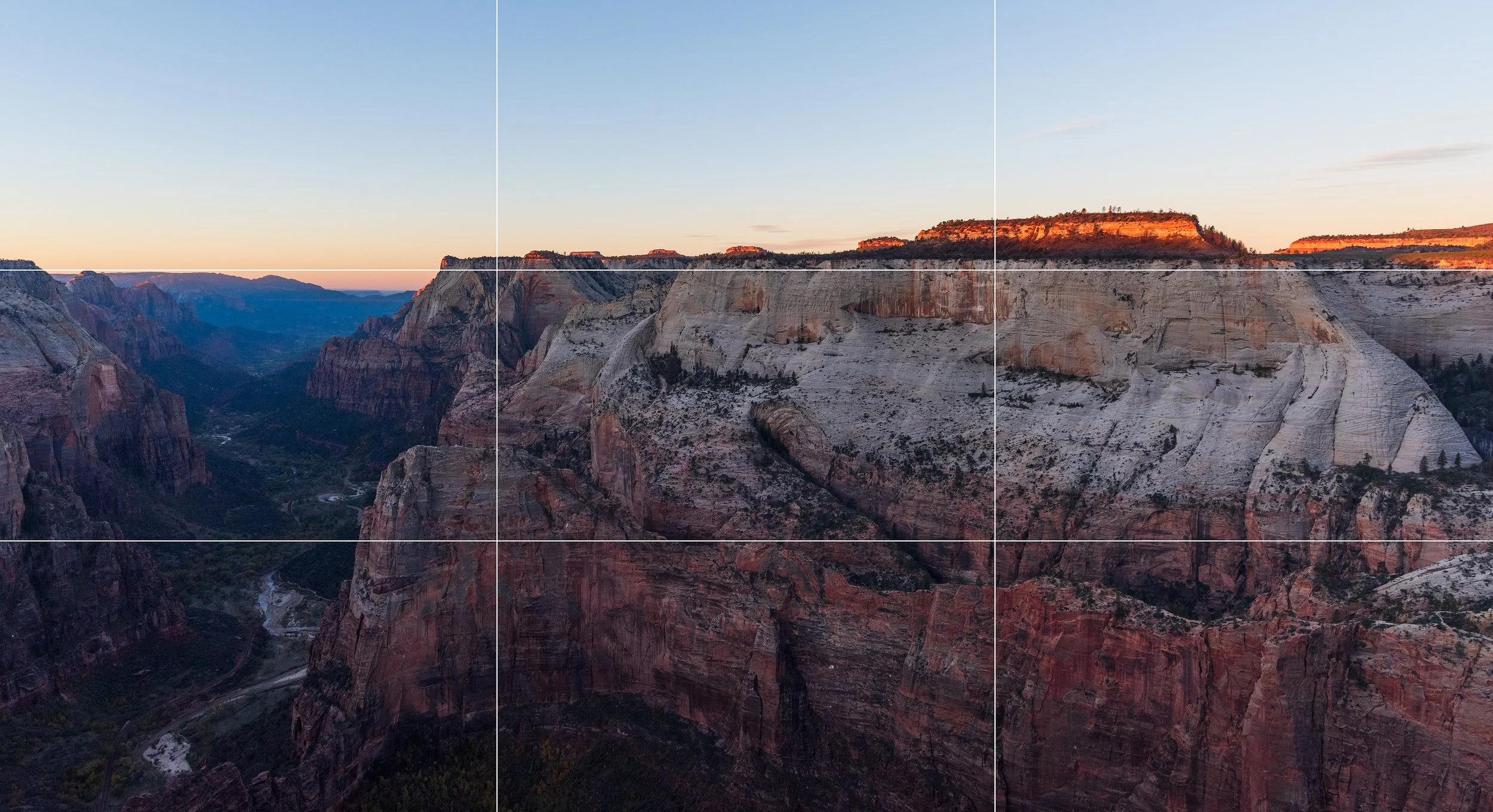
The Rule of Thirds forces you to make a choice.
If the sky is dramatic—filled with towering storm clouds or the fiery colors of a sunset—I’ll place the horizon on the bottom third line. This dedicates the majority of the frame to the sky, clearly telling the viewer, "This is the hero of the shot." Conversely, if the sky is a flat, cloudless blue but the foreground is filled with interesting textures like rocky coastlines or wildflowers, I’ll place the horizon on the top third line to emphasize the land.
However, a word of caution as you experiment with this: be mindful of what ends up in that "smaller" third of your frame.
It’s easy to get so focused on your main subject that you accidentally leave a tiny, distracting slice of something else at the edge. I’ve often seen (and taken!) photos where a beautiful landscape is marred by a tiny sliver of bright sky at the very top or a cluttered bit of dark soil at the bottom. These "bits and pieces" don't provide context; they just pull the viewer’s eye away from the story you’re trying to tell. If that smaller section isn't adding value, don't be afraid to lean even further into your composition to crop it out entirely.
Putting It Into Practice: Portraits
In portraiture, the Rule of Thirds is just as powerful, but the application is slightly different.
For a standard headshot or environmental portrait, the eyes are the anchor. We naturally look at eyes first. Placing the subject's eyes along the top horizontal line—specifically at one of the intersections—usually creates the strongest connection.
I often use the top-right or top-left intersection for the dominant eye (the one closest to the camera). This leaves space in the direction the subject is looking.
This concept of "looking room" is crucial. If your subject is looking to the right, place them on the left third line. This gives them space to look into. It feels comfortable and natural. If you place them on the right third looking right, they’re staring off the edge of the frame, which can create a feeling of tension or unease (which is fine if that's what you want, but it’s good to do it intentionally).
The Grid Is Your Friend (Literally)
One practical tip that helped me immensely was turning on the grid overlay on my camera. Almost every modern camera—and smartphone—has a setting to display a 3x3 grid in the viewfinder or on the LCD screen.
Having that visual guide is a game-changer when you’re learning. It takes the guesswork out of alignment because you can physically see where the lines fall and adjust your composition before you even press the shutter. It’s important to utilize every advantage available to you, and the grid is one of the best. I often leave it on just to keep my horizons straight and ensure my composition is intentional.
That being said, a grid of lines across your beautiful scene can sometimes be a distracting element when you're trying to focus on the mood or emotion of a shot. My advice for beginners is to learn how to quickly toggle the grid on and off. Use it to check your alignment, but make sure you know how to clear the screen instantly if it starts getting in the way of your view.
When to Break the Rule
Here is the nuance that took me longer to learn: The Rule of Thirds is a guideline, not a law. There are times when ignoring it completely leads to a better image.
Symmetry is the biggest exception. If I’m photographing a reflection in a still lake, placing the horizon in the center emphasizes that perfect mirror effect. Moving the horizon to a third line would break the symmetry and weaken the impact.
Maintaining symmetry in this image is more impactful than trying to compose with the rule of thirds in mind
Similarly, sometimes a center composition just feels powerful. A lone tree in a field, a person standing in a long hallway, or a close-up detail shot can often benefit from being dead center. It creates a sense of stability and authority.
The key is intention. Break the rule because the image demands it, not because you forgot to compose the shot.
Post-Processing and the Crop Tool
One of the great things about digital photography is that you get a second chance at composition in post-processing.
If I’m shooting quickly—maybe chasing wildlife or capturing a candid moment—I might not nail the Rule of Thirds perfectly in camera. That’s okay. When I import my photos into Lightroom (or whatever editor you use), the crop tool almost always has a Rule of Thirds grid overlay.
I use this all the time to refine my images. Sometimes a small crop to align a subject’s eye with an intersection point creates a much stronger image. It’s a great way to "save" a shot, but it’s also a great learning tool. By playing with the crop, you can see how shifting the frame changes the balance of the photo.
However, I try not to rely on cropping too much. Getting it right in camera ensures you’re using the full resolution of your sensor and forces you to slow down and think about the shot in the field. But for those moments when you’re rushing? It’s a lifesaver.
Conclusion
Mastering the Rule of Thirds isn’t about rigidly adhering to a grid for the rest of your life. It’s about training your eye to see balance.
It teaches you to stop placing everything in the middle and start exploring the edges of the frame. It encourages you to think about negative space, looking room, and visual flow.
Once you internalize it, you’ll find yourself doing it without thinking. You’ll lift your camera, shift your angle slightly, and lock in a composition that just feels right. And eventually, you’ll know the rule well enough to know exactly when to break it.
So, the next time you’re out shooting, turn on that grid display. Experiment with placing your horizon high or low. Push your subject to the side. See how it changes the feeling of the photo. You might find that a simple shift in perspective makes all the difference.